
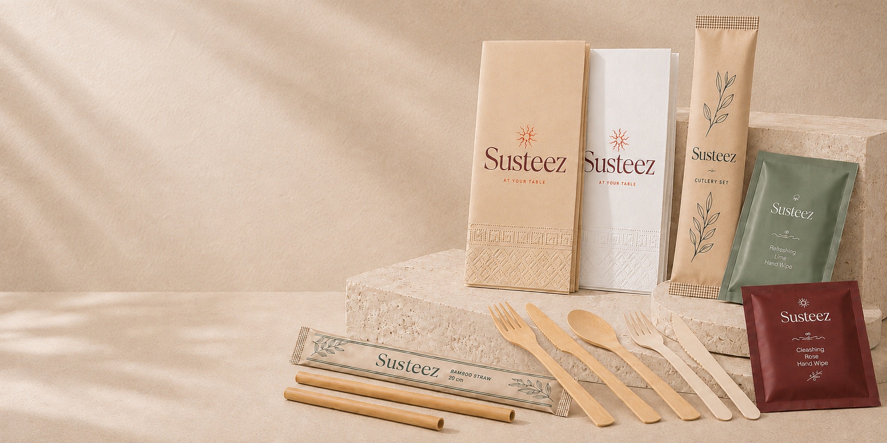



Kraft Napkin or White Napkin?
A comparison of appearance, print contrast, cost and brand perception.
Quick comparison
When is kraft right?
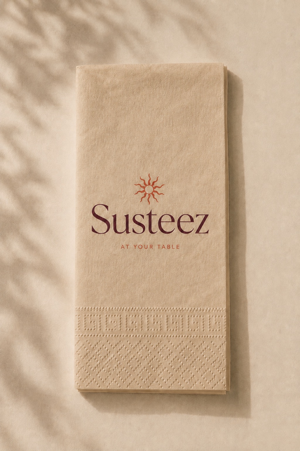
For venues that have made naturalness part of their brand language: third-wave coffee shops, wellness-focused restaurants, farm-to-table concepts, beach clubs. With no bleaching process, both the unit cost is lower and your sustainability story is stronger.
What to watch out for
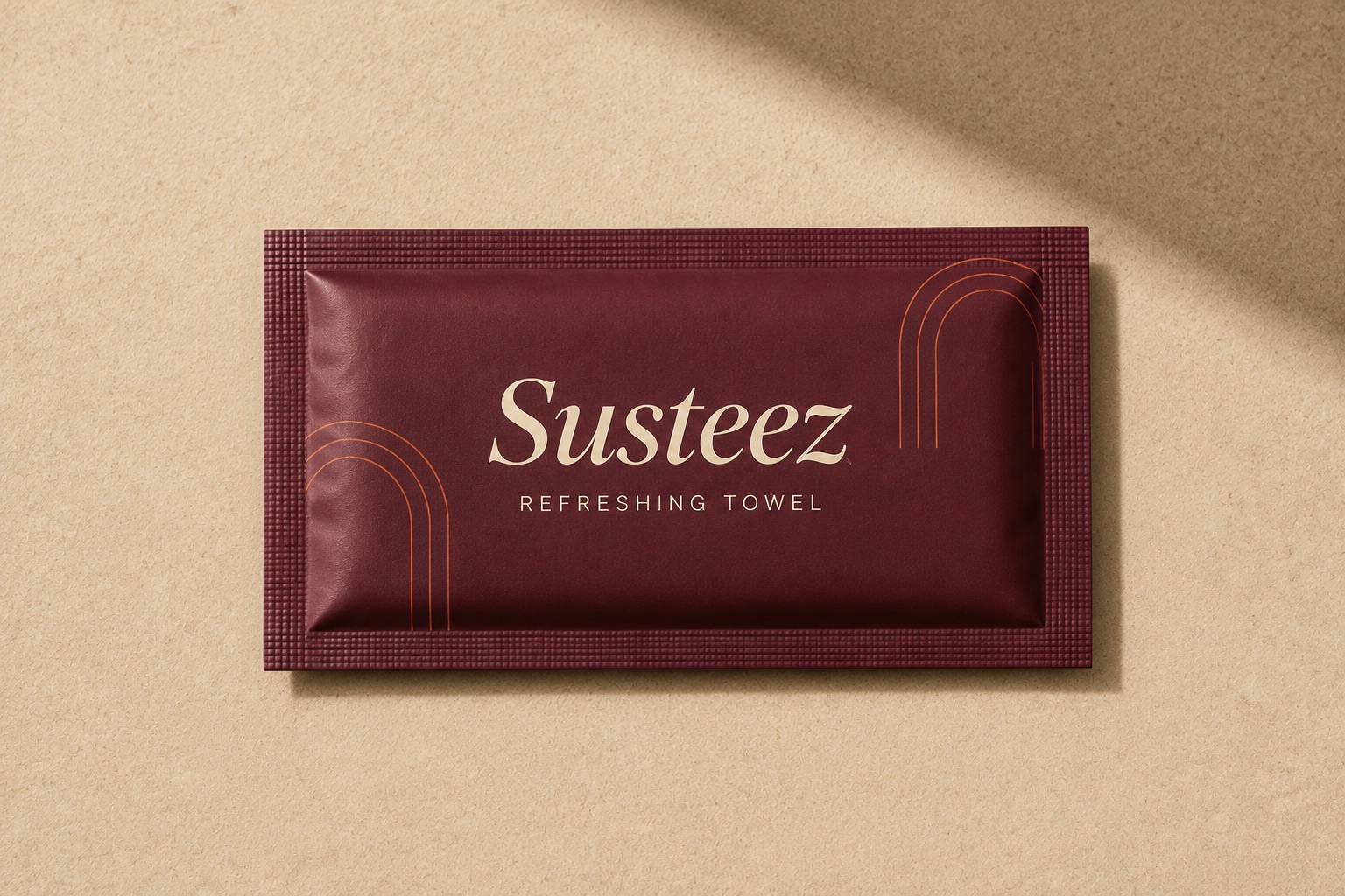
If you want to print light colours (yellow, light blue, white) on kraft, contrast will be low. Dark single-colour prints give the best result on kraft: black, dark green, navy, burgundy.
When is white right?
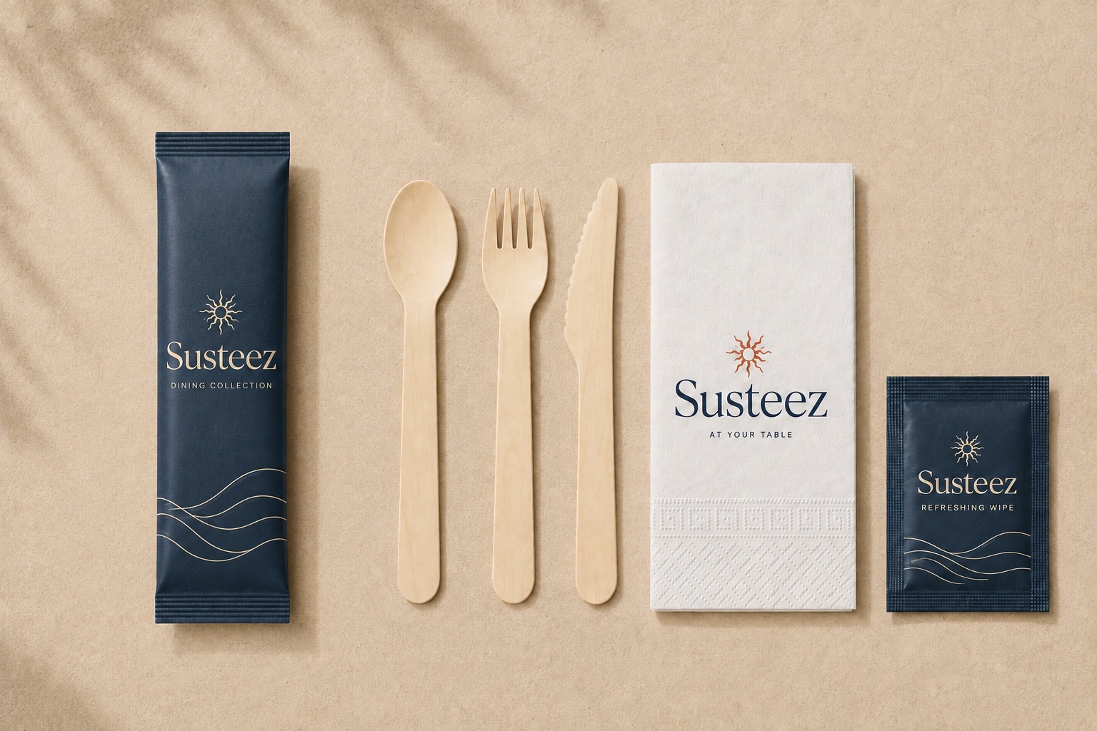
When colour fidelity matters. If your logo is multi-colour, your corporate colour is in light tones, or you'll print a full-colour image, white paper is the only correct base. It meets sector expectations in hotels, corporate events and fine dining.