
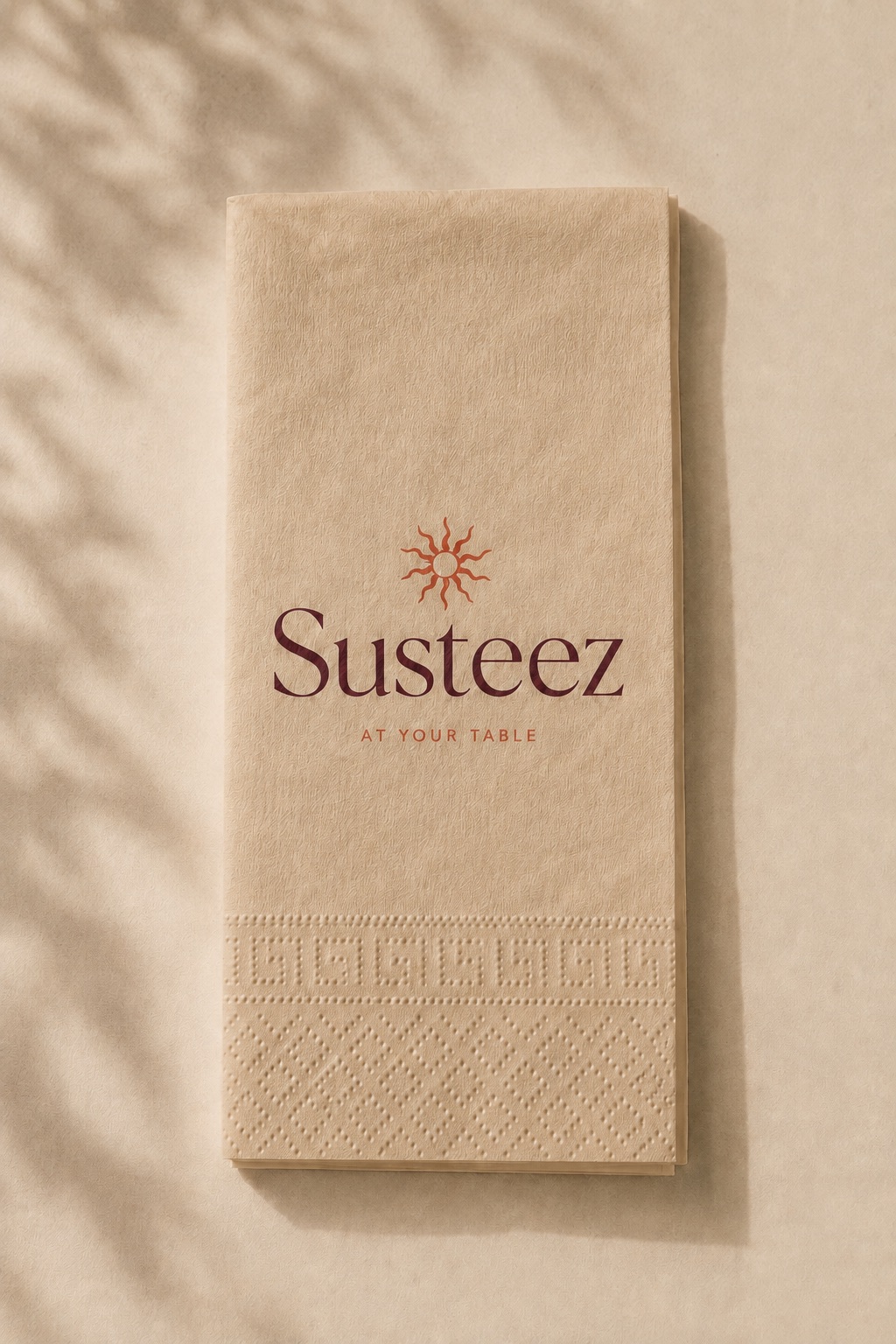
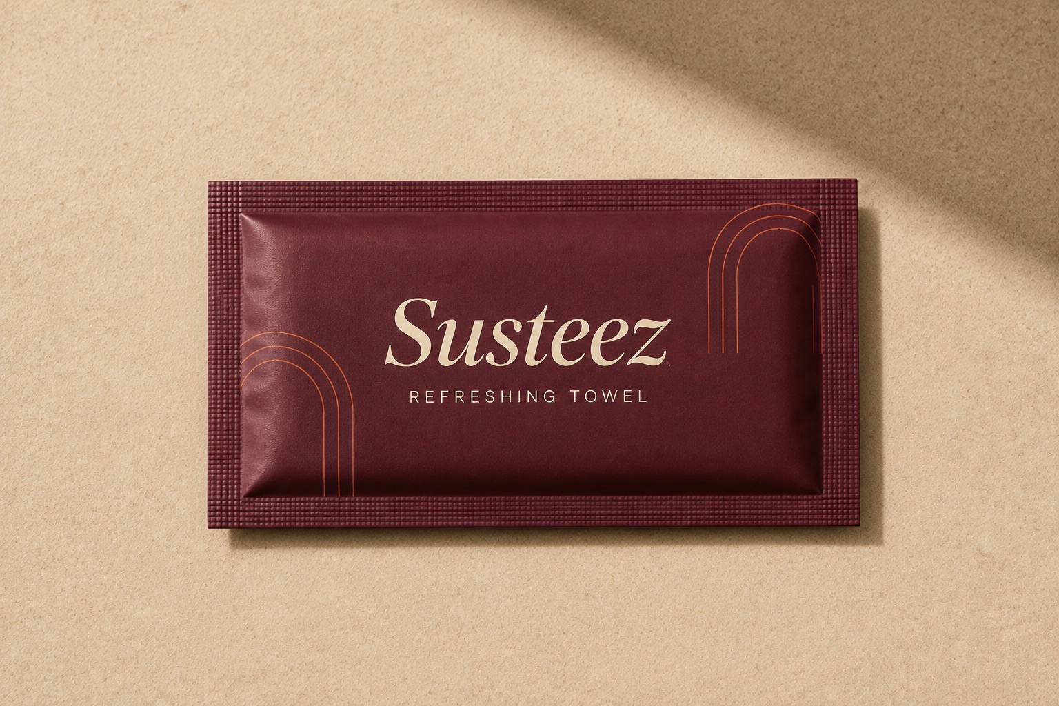

How to read a print proof
A proof shows how artwork will appear on the product before production begins. Once approved it becomes the reference: a fault noticed later, if it was visible on the proof, counts as approved by the buyer. Colour, position, size and legibility should each be checked separately.
The checklist
- Colour — close to the brand colour, and holding if a Pantone was given
- Position — centred in the print window, no drift
- Size — the logo at the expected scale
- Legibility — do fine strokes and small type survive
- Spelling — brand name, address and phone number
- Edges — anything crossing outside the safe area
Digital proof against physical proof
A digital proof verifies placement and scale. It does not verify colour, because a screen emits light and paper reflects it. Where colour is critical, ask for a physical proof; on coloured substrates such as kraft and wood this is close to mandatory.
What gets missed most often
A typo. While colour and position are examined closely, a misspelled brand name or an old phone number slips through. Having someone other than the designer read the proof removes most of this.
What approval means
Approval means 'produce it like this'. The run is made against the proof and the whole batch comes out the same. Correcting something at proof stage is easy; correcting it after production means producing again.
Asking for changes
Requesting changes is normal and expected. Each round adds to the schedule, so gathering every change into a single response shortens the process.
Frequently asked
- Is a proof charged?
- A digital proof is part of the process. A physical proof is assessed separately depending on product and quantity.
- Who should approve it?
- Whoever holds the decision. In businesses with a brand guideline, having marketing see it prevents objections later.
Last updated: 2026-09-13