

One colour or several?
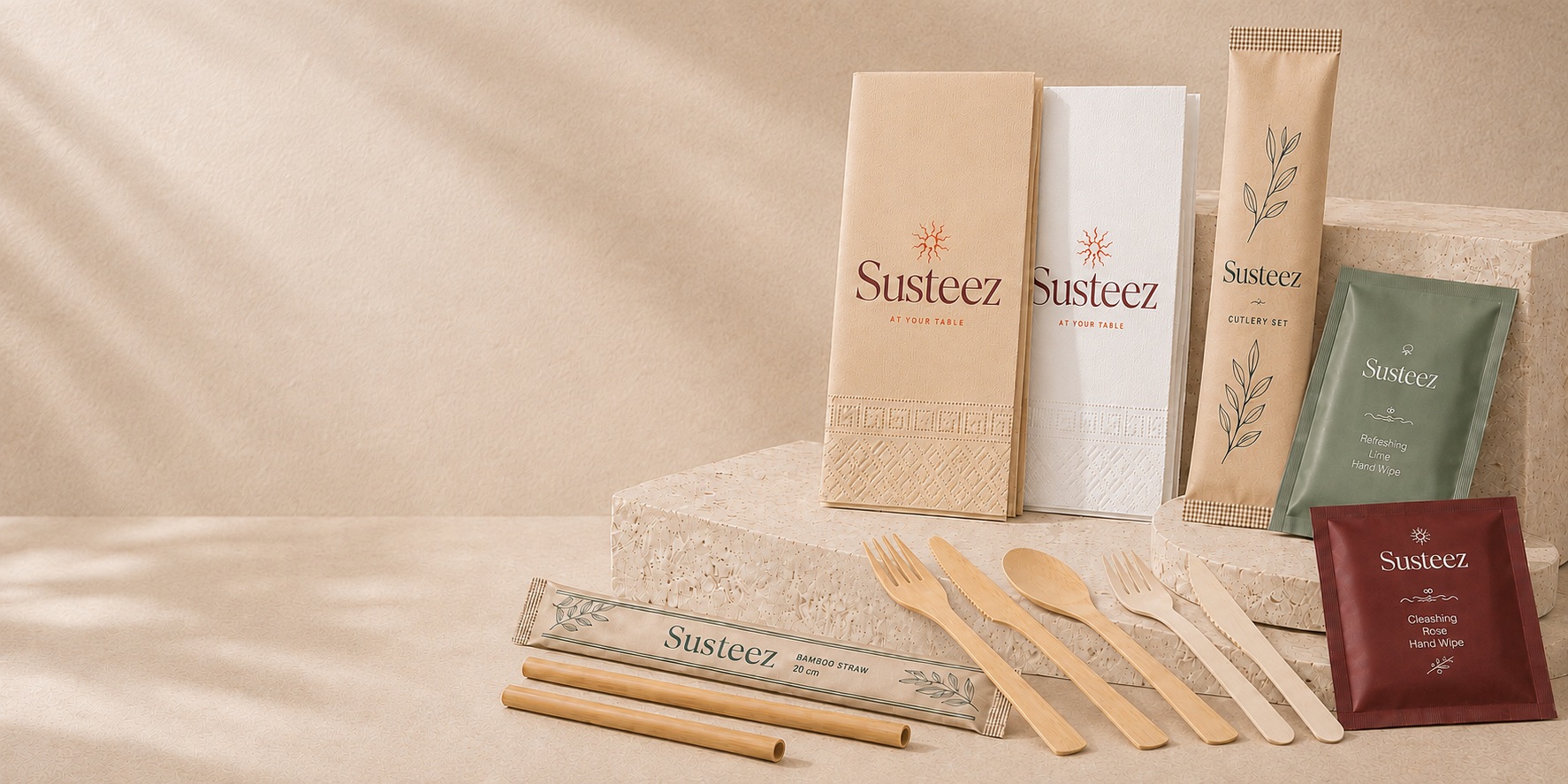
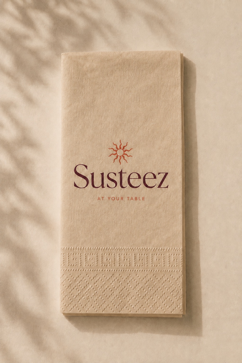
Every additional colour means another plate, another pass and another registration risk, so cost rises with colour count. On coloured substrates such as kraft and wood, multicolour also reproduces weakly. Both facts lead to the same conclusion: on a natural substrate, a single dark colour is cheaper and sharper.
What colour count changes
The substrate decides the outcome
White paper returns colour close to intent. Kraft warms colours and weakens light tones; on bamboo and wood, cool colours go flat. This is why the colour chosen on screen is not the colour that arrives on the product.
Why white ink is a problem
White has the lowest opacity of any ink. Printed over a light or coloured substrate, the substrate shows through and the result looks washed out. Brands wanting a white logo on kraft should not decide without seeing a sample.
When Pantone is necessary
Whenever the corporate colour has to hold. A colour mixed from CMYK shifts between runs; Pantone is a single pre-mixed ink and therefore repeatable.
Practical advice
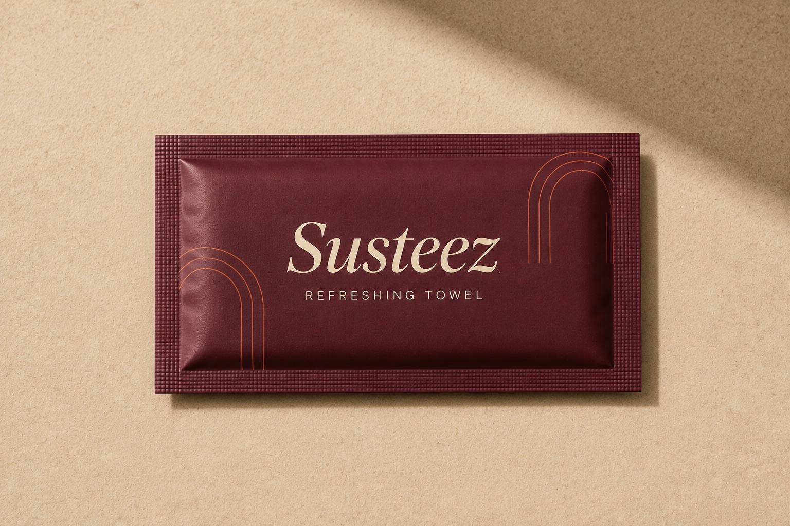
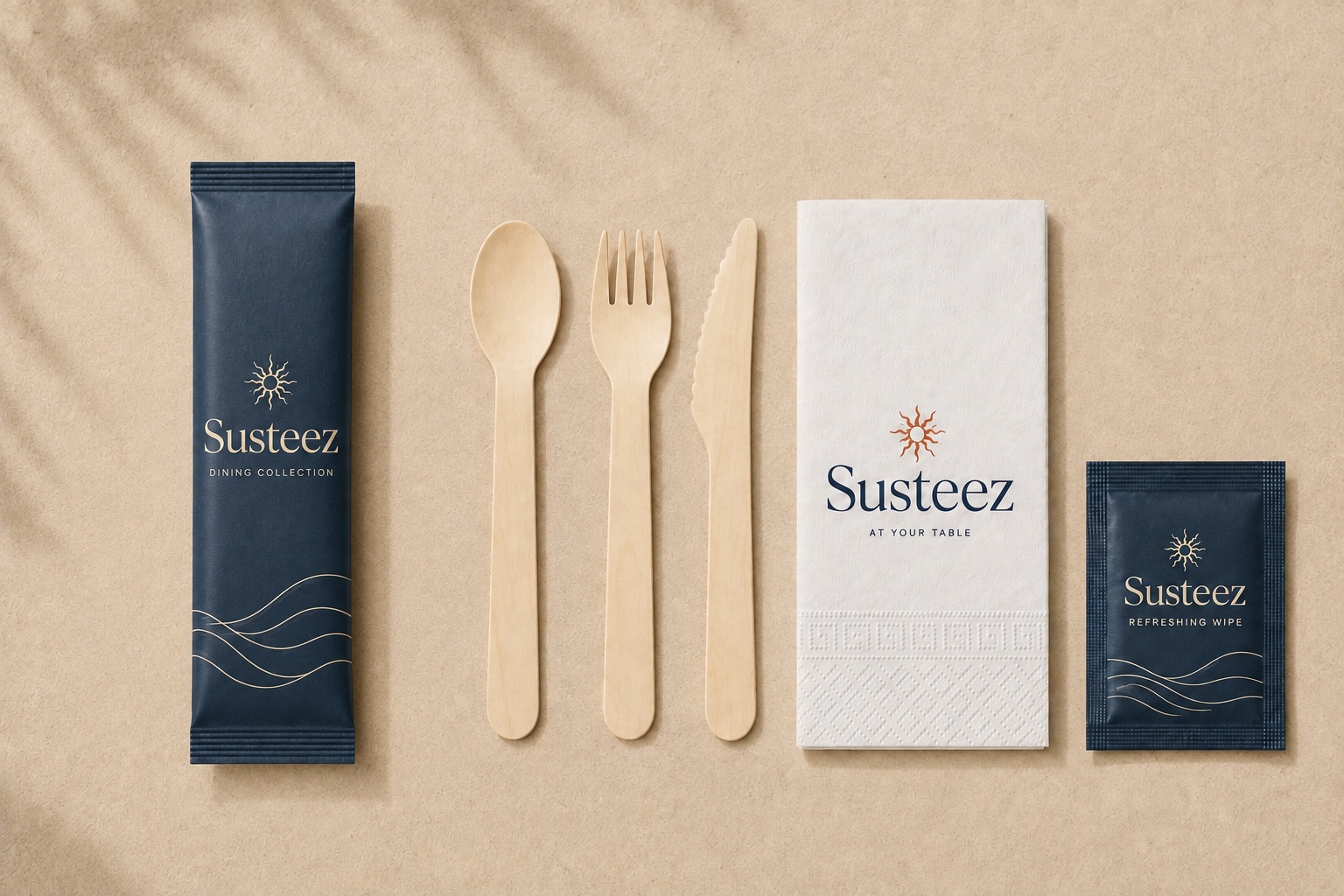
On a natural substrate, one dark colour — black, deep green, navy, burgundy — gives the sharpest and most economical result. Brands with multicolour identities should consider preparing a single-colour version of the logo for these products.
Frequently asked
- Can gradients be printed?
- Not practically in pad printing. On paper it is possible, though the substrate colour can disturb the transition.
- Can I see a colour sample?
- That is what the proof is for. The approved proof becomes the reference for production.
Last updated: 2026-09-13